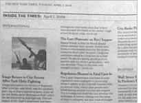
As I'm not in NY right now, I don't have access to a copy of the Times, but apparently, they've introduced a new design type that front loads a bunch of summaries into the first 3 pages of the paper.
Sounds like a good idea to me – people are used to seeing quick little blurbs on the web all the time. Moving a print paper in the same direction seems like a logical choice. Of course, it only works if you have full articles to back the summaries up.
